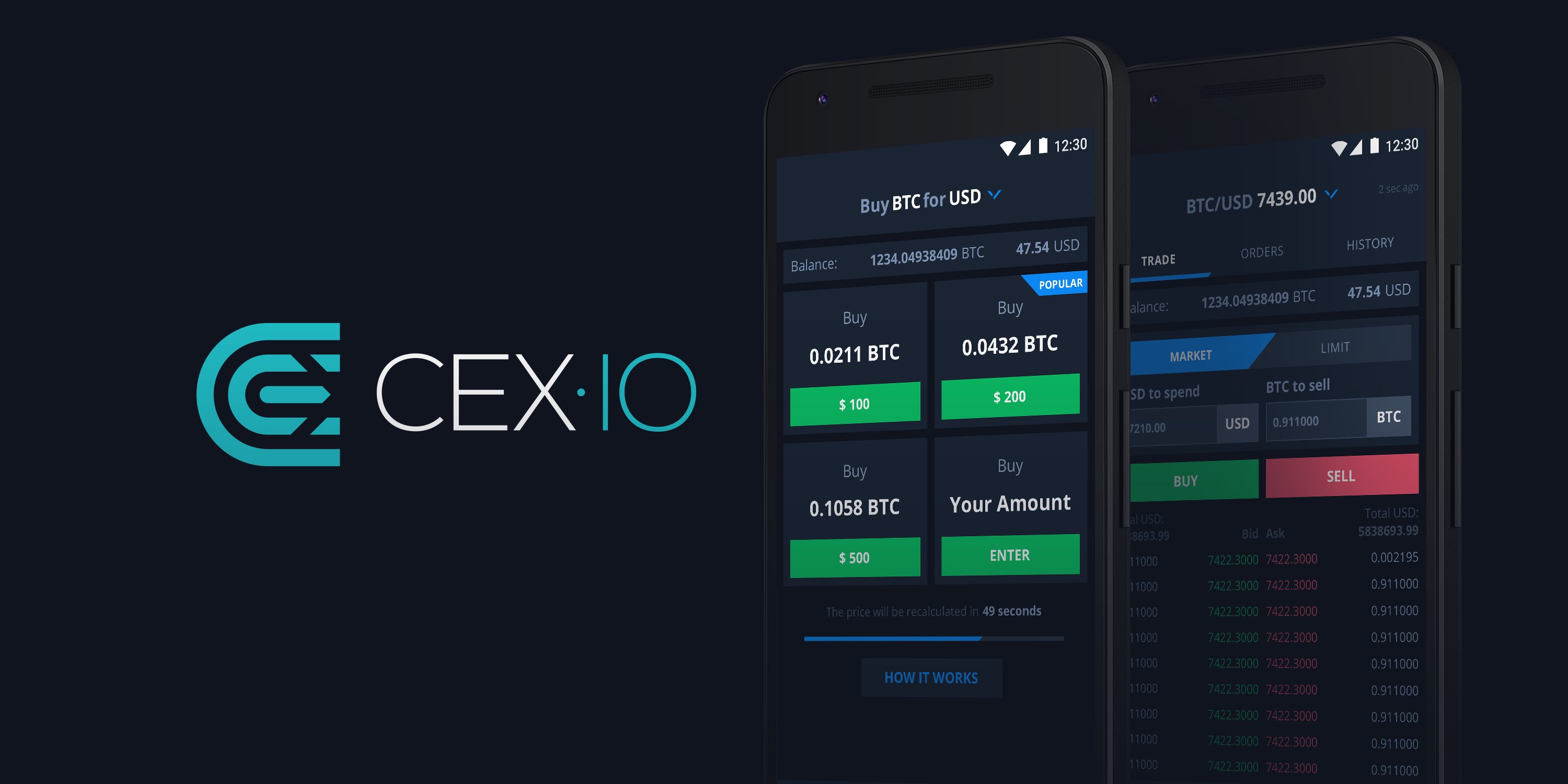
After CEX.IO upgraded its KYC procedure, the mobile app is a primary tool for users to pass verification. So we decided to improve user experience in the app and created a new design for the Android mobile app.
Our app is a fully functional trading tool that you can use to make informed on-the-spot decisions. That’s why we believe that the improved design will boost user experience and make interaction with the app easier.
Improved Navigation
The major change in the Android app concerns navigation and the way you interact with the app. While adding new features, we’ve realized that it comes at the expense of convenience. So, we have decided to redefine our approach to navigation and make all essential features available within just a few taps.
For user convenience, we’ve removed the menu bar on the left and placed all important elements at the bottom of the screen. In the menu, you can now find five tabs – namely Buy, Trade, Balance, Market, Profile – that will allow accessing all the features in a few clicks. Balance and Profile are new additions there. The Profile tab allows setting login and notification preferences, managing your cards, and contacting support.
Seamless Interaction
The best user experience is straightforward. So, we have added important notes and clarifications to the processes and actions you may need to take when navigating the app. This concerns the information that is required at different stages. We’ve also added warnings to draw your attention to the data you’re entering. Overall, we’ve made text notifications more informative for you to have a better idea of what is expected to be done, and when.
Brand Recognition
While making all those changes to the interface, we’ve also tried hard to keep our brand identity. So, we’ve focused on fonts, colors, and buttons to simplify the design and make it easier for you to get through the app. We’ve experimented with colors to make buttons and important interface elements more distinct. The brighter colors allow emphasizing the importance of specific elements.
With this simple and smart design of our Android app, you’ll get an exceptional trading experience and enjoy using the app.
If you are interested in trying the mobile app from CEX.IO, you can easily download it from App Store or Google Play.
Have a great trading experience!


