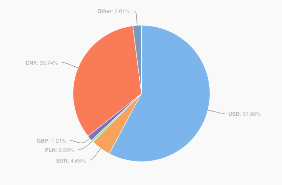
Many of you may wonder about the currency distribution within the Bitcoin ecosystem. In order to answer this question we should analyse statistical data and compare the distribution rate of various fiat currencies. Currently, there are two different resources available for our research — bitcoinity.org and coinometrics.com — both equally reputable and trustworthy. Even though these websites do their best to provide the crypto-community with up-to-date information, in this case we see that their stats are very different.
The pie chart from coinometrics.com obviously shows significant prevalence of the US dollar, whereas the graph of bitcoinity.org reveals extensiveness of the Chinese yuan. The question, “Why are the results different?”, automatically comes to mind. The reason for such opposite result lies in the different sources of the data. coinometrics.com, for instance, uses stats of 82 exchanges around the world, whereas, bitcoinity.org surveys a narrower number of exchanges, and therefore, not only do the numbers differ, but the results appear to be absolutely opposite.
This short analysis of the currency distribution serves as solid evidence of the necessity to continue developing the Bitcoin industry in terms of data collection. We need more precise and error-free statistics in order to make accurate analyses and predictions.

Source: coinometrics.com

Source: bitcoinity.org
By Kateryna Iesypenko for CEX.IO
