Since its launch in December 2015, the mobile app has become a handy trading tool for different users. It fits both newbies taking their first shaky steps in trade and confident traders with solid experience behind them.
As well as sharing similar features with the website, the mobile application offers an easy trade on the go for those who like to be in the loop of crypto market changes and make smart, on-the-spot decisions.
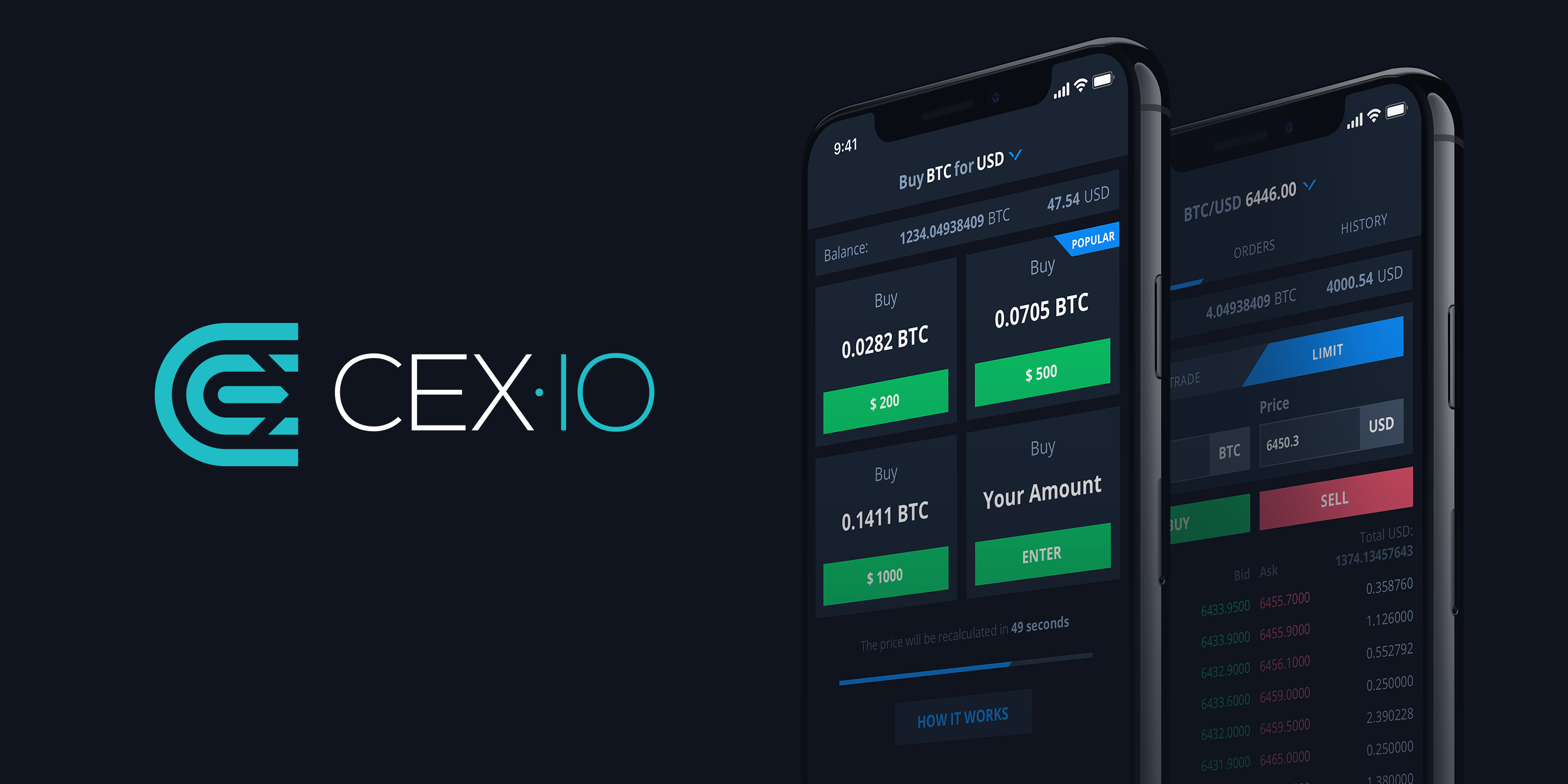
Within the “Keep it simple and nice” premise, the app design has remained more or less the same: intuitive navigation, user-friendly interface, laconic style. A simple trade app.
Why re-design?
We strive to meet customers’ needs by enhancing our product and implementing new features. This made the app a bit more complex. But we have taken care to keep a smart combination of the original simplicity and convenience at users’ fingertips.
In a fast-growing and dynamic environment, it can be challenging to keep up with the pace of change. Thus, we came up with a new idea not only for how the app looks but also how it works, to give customers a better feeling of how they use it. Thus it has become a smart trade app.
What has changed?
It has been an exhilarating journey full of creative ideas, expressive discussions (i.e. arguments with our UI/UX designers) and complete focus. Now we are excited to present the result: a new design that looks eye-catching and stylish, yet simple and smart.
Apparently, we’ve spotted cracks in such a key area of user experience as navigation: getting through the app wasn’t such a no-brainer as it first appeared.
Now, before getting started users can have a brief overview of the app, to get an idea of what’s inside and how to handle it.
Navigation
A good user interface is one with as few buttons as possible. It increases the chances of hitting the right one at the first touch. With the range of features we’ve packed into the application, it was a struggle to keep them all within at least two-tap access. Sticking to this approach, we decided to add another menu bar and split all the features between the side and bottom tabs. According to our customers’ feedback, it was good but it wasn’t great.
So we reached the point of re-imagining the approach to navigation. We removed the hidden left side menu and placed major features at the bottom of the screen to make them easy to find.
The only menu now consists of just five tabs: Buy, Trade, Balance, Market, Profile. The new tab here is Profile. It allows users to customize the app, set their notification preferences and manage app login credentials. We also moved Card Manager and Support sections here to make them easier to handle from the personal page.
Textual hints
It’s always better to be sure what you’re going to get after hitting “Proceed” or “Confirm”. So we improved user experience all the way through the app by adding clear explanations of what information is required at what stage, and what’s going to happen next.
Considering all the trade risks, we added a number of alerts to draw users’ attention to the data they enter, to prevent any mishap or loss. We made the notifications more informative. That allowed us to communicate important nuances to users and provide clear navigation by highlighting the major key points.
Interface
Updated navigation required a properly adjusted interface. This was quite daunting as we didn’t want to go too far and lose brand recognition due to major visual changes. We created new design standards through such fundamental elements as font, spacing, colors, lines, icons, and components like alerts, avatars, and buttons.
In addition, the main interface layout got a new color palette. The bold black was complemented by cool grey shades. Our logo looks more confident and impactful on this background. In contrast with the dark layout, bright icons, buttons and status bars appear clear and refined, making the whole app interface feel striking and beautiful.
The new design has been an important milestone in improving our customers’ experience. It’s not just about how the “Next” button looks, but about where it takes you and how it feels to be there: Confident, Secure, Smart.
Welcome, and enjoy!
If you’d like to start using CEX.IO mobile app, you can download it from App Store (for iOS) or Google Play (for Android).
If you found yourself reading this far, here’s a short introductory video to the updated mobile app